
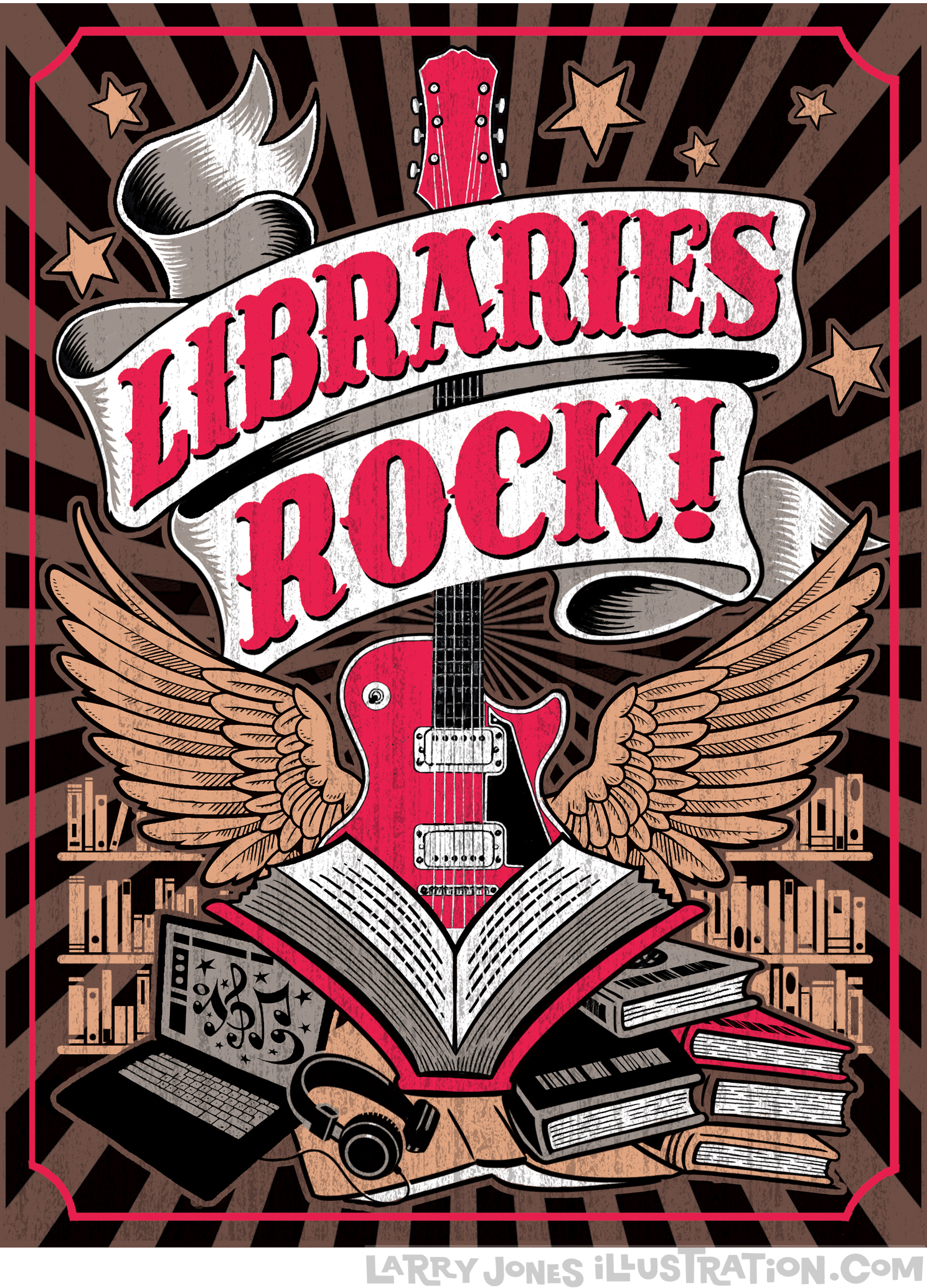
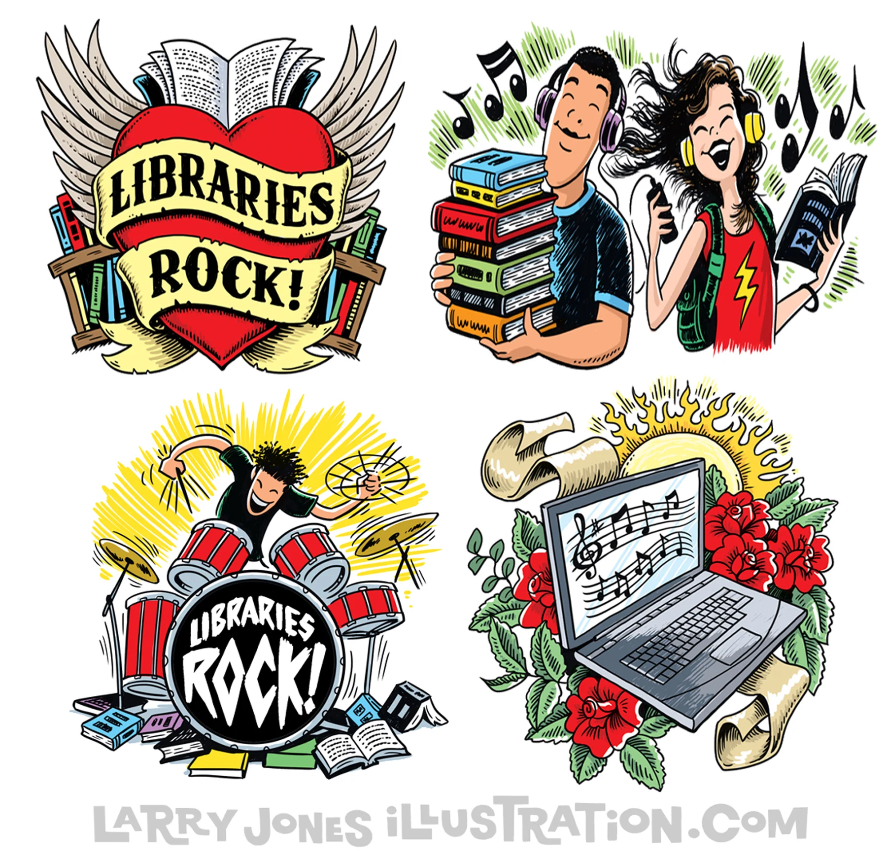
Every year I have the pleasure of creating a series of posters and spots for the Public Library system. One of the reasons this particular job is so much fun is that I get to work in a different style every time! This year's flavor was concocted from a combination of tattoo art influence and a bit of 60s rock album cover art. The nice thing is that this is basically how I doodle all the time anyway! Please take a moment to pop over to my site and check out all the styles I currently work in. I'm still cooking with a lot of pots, which is how I like it! I'd love to cook up something for you!

Which Two Are the Same?...
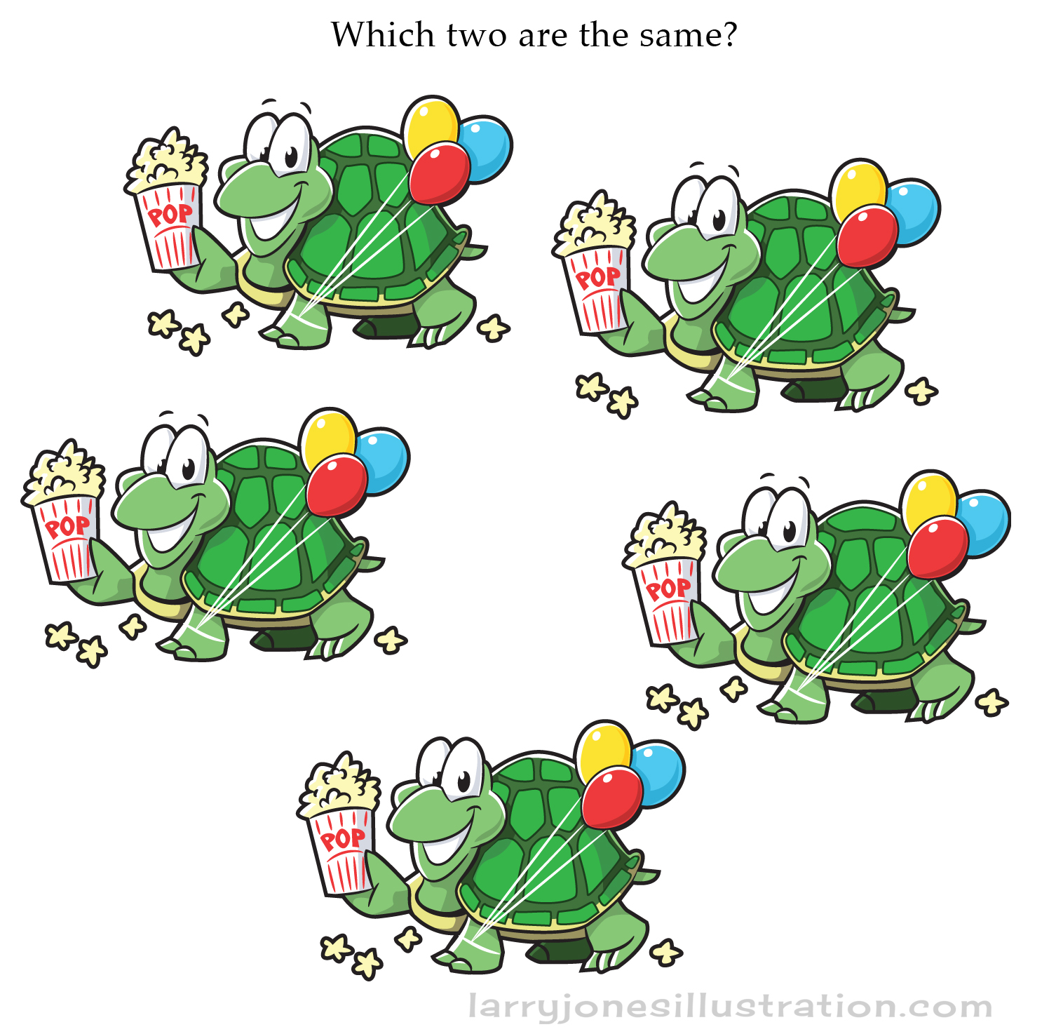
Also... for the same Highlights Puzzlemania issue, this was an additional game illustrated to go along with the "differences" puzzle. It was made for little kids, but how fast can YOU figure it out?...
Cover and Interior Illustration for Highlights Puzzlemania Book
So... every now and then the little kid in me gets all giddy because I get to work for one of the companies I grew up with. Many a dentist's office visit I spent searching for hidden pictures in a Highlights magazine. Here's a recent cover I got to create for an issue of a Highlights Puzzlemania book. The illustration also appears on the inside with a nearly identical version next to it with 20 differences to find. Check out the pics below in case you're stuck in a dentist's office with nothing to do.


Find twenty differences on the next picture...

Find 20 differences from the previous pic!

Here's the original sketch with cropped areas indicated for cover and interior activity pages.
Being an Illustrator (or Two or Three)
The “experts” all say the same thing: “Don’t confuse people with unrelated styles on your website.” “Stick to one look or you’ll never make it as a world-renowned illustrator. After all, it might look like you’re unprofessional… or even worse… that you’re not FAMOUS!!!” Honestly, if you think about it, “famous” kind of means being well-known enough to have the amazing pleasure of being locked in to the same style over and over and over and over and over and over and over…and over…” I don’t know about you, but that’s not the kind of artistic future that motivates me.
I get it though. Their advice is actually sound and well intended.
So, in spite of this sage advice, why did I branch off into a totally non-related “cut-paper” look for this particular job?… Well, first of all, because I knew it would be a great fit for my client’s subject matter but furthermore it was because, for almost three decades now, the fun of branching off and actually enjoying the freedom to experiment as an artist is what’s kept my business, well, busy! If there was a chef who was excellent at making one particularly amazing gourmet dish and was told to only make variations of that dish night after night, year after year… I’m certain they’d eventually be sick of the kitchen and want to seek more exciting employment. So why in the world are we told that clients are too mindless to see that versatility in an illustrator is an ASSET?

I believe it comes down to fear. We don’t want to mess with that “illusion” that we’re so much more “successful” than perhaps we actually are. If you ask me, life’s way too short for that kind of nonsense. It’s a natural game of business to create that illusion for a customer and it may be quite prudent to play that way, but I’m a firm believer that the honest approach is much more enjoyable and fulfilling. People expect a con these days. Honesty is a rare trait in business and perhaps the one asset, beyond any talent I may have, that has kept my work thriving over the years.

Sometimes an alternative illustration style is just the thing that what would fit a particular project perfectly. I’ve had the true pleasure of working with many wonderful clients who trust my judgement on changing a style to fit a particular theme. To all the artists and illustrators out there who have been told (with good intentions) to knock it off with the creative detours… Isn’t that what making art is all about? Exploring, discovering, expanding, evolving, being excited, even thrilled, etc?

So here’s a great question to ask when approaching any job: How can I have an utter blast solving my client’s illustration needs and delivering art that thrills them far beyond their expectations? Sometimes you just have to ask their permission to go in a new direction. Solve this competently, and everyone wins… and... you get to continue to play in new realms over and over and over and over again.